Tuesday 12 May 2009

Menu / Controls / Tutorial Level / Preloader

The following are screenshots of a couple of things I've added to the game.


Menu Screen - I added a more appealing background than just black, plus the animation for the title has been fixed. Also, I've added some navigational aids.


Options Screen / Controls - The controls for the 360 controller (made it in Illustrator), hmm I should put the keyboard controls in as well, not everyone will get to play it with a 360 controller, plus, its only a demo on how it would play on the 360, being designed for it and all.


In-Game Tutorials - They are instructional aids in-game on what controls the player needs to press to jump, attack, open item boxes etc.


Preloader - This preloader is used before each level opens.

Saturday 9 May 2009

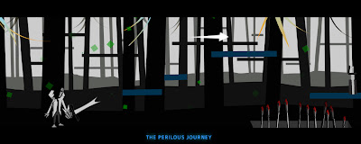
Level: Progress 2


I have amended some of the problems brought up in the user testing. The screenshot above shows the platforms in the forground that are now blue than the same colour as the trees as before, which made it difficult for the user to find the platforms to jump on. I have also added some other things such as a cinematic mode. The mode is triggered when diologue, titles of levels and cut scened events occur. For most of these cinematic events the player is free to move through the level. Another thing that a fellow game designer mentioned was that the game had significant slowdowns, I think this was because of the particles system. The particles in the setting have now been decreased to up the performance. Things that need to be done:

1. In-game tutorial [part of the 1st level, needs visual feedbacks / controls]
2. The 2nd Level! [still editing the platforms for this level, but will be done very soon, bet you're getting sick of seeing the same forest level?!]
3. For some reason I can only get one enemy working on each level, the enemies are not dynamically attached to the level, they are placed inside the level so each enemy has their own instance names (argh, I know there is a easier way of doing this, but no time to learn nows), so they must be the problem with instances conflicting with each enemy.
4. Dexterity-based platforms and a boss encounter in the 2nd level.

so yaah, deadline is slowly creeping up, and I still haven't started with the design doc! urrrrhh, need to start now, byes.

Sunday 3 May 2009

Xbox 360 Controller Layout

The basic controls of DH are assigned to a Xbox 360 controller. I've been looking around for some free programs that assign key pressed on a keyboard to buttons on a 360 controller (the game is designed as a XBLA game, so it would be awesome to make it act like one). I found this program called Xmapper, It uses an on-screen keyboard to assign the key strokes that I set up in Flash to the controller elements, but I first let the program detect for my 360 controller that was plugged into a USB port, and required the latest 360 drivers. It was pretty easy to configure with a wired controller, but if I wanted it be set up with a wireless 360 controller, I would need to buy a wireless gaming reciever, but I'll sticking to a wired pad, its less of a pain and doesn't hurt my wallet.


As you can see my keys assigned in Flash were all over the place, the reason being was that some of the keycodes (the numerical values of keys in actionscript) were inactive or they were not processing the triggered actions events, but some keycode were working fine so I used them instead. In the end, the placement of keys on the keyboard didn't matter now that the controls are set to the 360 controller.

The Control Layout for the Xobox 360 Controller:

Directional & analogue Left/Right - Character Left/Right Movements
A Button - Character Jump
B Button - Deploy Special
X Button - Primary Attack/Weapon/Item Pick-up
Y Button - Secondary Attack
Right Trigger (Cycle) - Specials
Right Button - (Timed) - Orb Collection


This is sample of when the player encounters a new weapon. The player presses the X button on the 360 controller to pick up weapons and items, but the button is also used as the character's primary attack when in contact with any of the above things. These controls are completely "pick-up-and-play" and the visual feedback for buttons pressed will be used for the tutorial level.

Saturday 2 May 2009

Level 1: Progress


The first level has changed a lot since the last time I demonstrated a prototype. the setting has changed to fit an in-game tutorial level, but the next level will carry on within the same level. The intro / tutorial level is set in a parallaxing forest, which as I have explined in previous posts that the forest background layers move at different speeds and distances such as the foreground moving faster than the background to give a pseudo-3d illusion of depth.

The level is fairly consistent and predicable at this stage, allowing simple movement and a small selection of combat moves. The level gives the player time to get a sense of the controls until they can perform actions and instantly know what to expect from the new game machanics. It is designed so that the player can familiarise themselves wiith the new visual style and the platforms that lead two different pathways. The platforms are a part of the forest in the level, which allows the player to move across branches or on the ground, but there will be some instances that require the player to move to the platforms because of certain obsticles.

The amount of enemies present are very minimal and function at their easiest AI configurations. The player should find oppitunities to play around in the environment until they have a firm grasp of the health particles setting. They will also be visual cues such as arrow directions for platforms,weapons, achievements etc, everything that is needed to progress to the next level. New gameplay mechanics will be introduced slowly and built on the existing controls so that it will be easier for players to effectively approach and use their new abilities.

Friday 1 May 2009

HPS: Progress

In the previous post about the the Health Particle Setting I mentioned that they were some performance issues when using pngs for each frame of animation in Flash. Testing with a sequence of PNGs prove to be a problem if I went with exporting all 200 pngs and sequencing them in order of the animation created in ParticlesIllusion 3 (This application allows for the particles effects to be exported in a sequence of PNG files with the option of alphering out the background). The animation would significantly slow down the animation in Flash, So after deciding not to use ParticlesIllusion, the only way to have a particle system work without having massive slowdowns is to generate it with code. I didn't see it at first but Flash's actionscript would be awesome in implementing a particles system with a low memory usage.

Flash is very efficient in generating a dynamic particle system that can easily be controlled and adaptable in the way I want it to act within the game's environment(particles that change from good to bad health), but I was worried that it would involve using particle physics equations in actionscript (I only know the basics of actionscript 2 and 3, I don't want to venture into more head aches than I already got with code). Luckily James, our games tutor was working on generating a snow particle system that was entirely done in actionscript. He was nice enough to let me experiemnt with the code to make it act the way I wanted it to.

So here how it works, the particles fall the same way as how rain or snow falls from the sky, which involves some sort of gravity and friction, but these forces are cheated to give the illusion of realistic rain/snow by making particles fall at different speeds and distances in Flash. The particles are also drifting across one side of the screen, representing a wind force on the particles. The last and most important thing the particles show is the player's health through a harminous sequence of colours that seemlessly change from green to red if the player takes damage. This is done by calling upon the player's current health, if the character takes a certain number of hits from enemies, the colour of the particles start to change after every 20 health points. If the player reaches zero health, the particles fade and the character dies.

Full/Medium Health Setting


Medium/Low Health Setting


Low Health Setting


The rotation of the particles also speed up everytime the health particle's colour change, where green is a very calm rotating speed and red is full chaotic spins. This adds stress towards the player, which makes them act more quickly and gives them the challenge of finding health to restore the particles setting.

Thursday 30 April 2009

Feedback / User Testing Post!

I asked a couple of dudes to test the game out so far, awesome thanks to those that gave it a shot. Anyways, Dream Hunter has been in the hands of some merciless game designers I know and I've noticed a trend coming from them:

1. It is unclear where the platforms are located in the level because they are the same colour as the foreground trees.

2. The platforms in the middleground are nearly the same tone as the platforms in the foreground. They percieve to be on the same layer, confusing the platforms that do react with player in the foreground (1. might fix this).

3. Not enough visual feedback on the objective in the levels and the controls.

4. The health particle setting doesn't not reset to full green particle health when the player dies and restarts. Also, The character's position doesn't not reset back to the beginning of the level when the player falls into a pit.

5. lack of animation and gameplay (gameplay I'm still working on, a majority of my time was spent in building the game engine in Flash,now that Ive done most of that I'll be concentrating more on this)

I will try fix these problems asap, but The GDD is in need of a phoenix down.

Health Particle Setting/System

These are the instances when the feedback changes according to the characters health, this gives the possibility of having a connection between the hero and the environment (and also other things, but I'll stick to only showing a more sophisticated health display for the prototype.

full health: 100%


70%


50%


30%


10%